For this article I wanted to talk about some very “down to earth” advice for creating user interfaces (UI). User interfaces are usually a large point of pain for new game developers. I also like to talk about more concrete topics every now and then, a lot of game design discussion can be very abstract and subjective, and while that’s fun to talk about, I find what new designers need is much more practical advice.
Also, since this article is directed at new developers, and the Unity Engine is such a common engine for new developers, I’ll be giving some Unity Engine specific tips. Let me know if you found these helpful!
Think About Your UI From The Start
Of all the advice I can give about UI, the most important is simply to be thinking about it right from the start. It’s really easy to focus on the core gameplay mechanics, and all the “sexy” parts of game design, without really thinking about what it’s going to mean for the UI. This is how games end up with unimaginative, purely functional UIs that don’t enhance the experience at all. I’m certainly guilty of it, and I know a lot of designers are guilty of it too.
Menus in particular are criminally under-thought. The trap you want to avoid is thinking of the menus as just a necessary evil that the player has to go through to get to the “actual game”. The whole thing is the “actual game”, including the menus. My attitude is that it’s important to think of your game as an experience, and that experience begins the moment the player has put themselves into your hands. It begins as soon as they land on your website, your Steam store page, Apple app store page, etc. Your menus are part of that experience too, and you don’t want to just leave it to design autopilot.
Keeping It Simple
The complexity of your UI reflects the complexity of your game. If you find that your UI has become very unwieldy, your game probably is too.
One of the moments that really opened my eyes when it came to designing UI was when I was listening to the developers at Blizzard talk about designing Hearthstone, which is a stellar example of good UI principles, and I’m going to be using it as an example for this whole article.
The developers of Hearthstone discussed how they actually cut features from the game, based solely on the reasoning that it would clutter up the UI. I thought this was very interesting, and an important learning experience. Most game designers would never cut features from the game just because of UI clutter and communication issues, but the designers at Blizzard certainly know their craft, and as a result Hearthstone is an incredibly accessible game.
Handling Aspect Ratios
It’s important to understand the technical limitations you will have to deal with when making a UI, as these will be dictating the design. One of the biggest hurdles that you will have to handle is that your end-users will have all sorts of different aspect ratios and monitor resolutions. Depending on the medium you’re releasing your game on, users’ aspect ratios can really be all over the place.
With that in mind, here are the three most common design paradigms for UI, which are basically all different solutions for solving the aspect ratio and resolution problem.
Method 1: In-Camera
The first method is what I call the “in-camera” method. The basic idea of this method is that it’s just like a camera looking at a scene, and in some engines this will be exactly what’s happening. As a result, regardless of how large of a resolution the user has, or what aspect ratio they are using, the amount of the scene the user sees will always be constant on the vertical axis. Depending on their aspect ratio, they’ll see more of the scene on the horizontal axis.
Because of how this method works, you’ll need to decide ahead of time on a range of aspect ratios to support. As a rule of thumb, you should support from 4:3 to 16:9. Supporting wider aspect ratios than 16:9 is fine, and some users will appreciate it, but not supporting down to 4:3 is a big mistake.
Now, you may be thinking, “who even uses 4:3 monitors anymore, surely I don’t need to support that?” but I assure you, even right now in 2017, a lot of people are using 4:3 monitors. If your game doesn’t work on them, you’ll be shocked how many complaints you get. Some people just never upgrade their monitor to the new wider ones, and a lot of people actually prefer them to widescreen monitors.
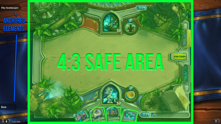
When making the UI with this method, you’ll need to make sure to keep all relevant information in the 4:3 safe area, and then outside of that is just padding to give the scene some space to breathe.
There are a lot of benefits to this style:
- It’s very simple to develop for.
- You can be assured that the UI will look the same on every user’s machine, and not worry about overlapping elements.
- It enables a very artistic visual style, and allows interlocking UI elements that aren’t possible with other methods.
- It works very well for menus and games where the UI and game-world are extremely interconnected, such as in Hearthstone.
- You don’t need to worry that users with absurdly high resolution monitors will have issues with UI elements being too small to read.
There are however, a few negatives:
- Assuming the user isn’t using an old monitor, there will be wasted screen real estate.
- The image on the screen will never be “pixel perfect”, the edges will never be perfectly sharp.
- Some engines have difficulty making text look crisp in this method, which looks unprofessional. Most modern engines have solved this, but it used to be a large problem with the Unity engine. Unity doesn’t have that issue anymore, but it could very well be an issue if you’re using your own in-house engine.
- If users have absurdly small resolution monitors, the UI won’t compensate, and those elements will become unreadable.
- It tends to use up more memory, as the textures that are stored need to be quite large in order to still look good at high resolutions.
Unity specific: to create a UI using this method in Unity, find the Canvas Scaler component of the root canvas game object. Set UI Scale Mode to “Scale With Screen Size”. Set Screen Match Mode to “Match Width Or Height”, and move the slider all the way to the right, toward Height. When you add any sub-objects, leave the anchor at the default, which is the center.
Method 2: Anchored Elements
The next method is the anchored elements method, where each UI element is “anchored” to a reference point on the screen. This method is pretty self-explanatory. You most often see this for in-game UI’s, where there’s a clear difference between the game world that you’re interacting with and the UI.
Benefits:
- When you want the UI to be as “out of the way” as possible, this method allows you to ensure that everything is flush against the sides.
- You can have pixel-perfect UIs with this method, resulting in an extremely crisp image. However, I recommend against doing so, because on very high resolution monitors all the UI elements will become extremely tiny, and on low resolutions elements will start to overlap and become unusable. Basically, you won’t know how it will look on every monitor. Making your UI pixel perfect prevents if from being future-proof.
- You can support a much wider range of aspect ratios. This is particularly good for games that you expect players to play in a window that they resize to their liking. For instance, maybe you can expect players to resize the game so it takes up just half their monitor, while on the other half they’re browsing Facebook. Even though your game is in a strange 8:9 aspect ratio, it still works. In practice, if you don’t set any limits then some UI elements will start overlapping, you may or may not want to allow that.
Drawbacks:
- Again, it doesn’t take maximal use of all the screen real estate.
- Any UI designed this way needs to have very discrete elements that don’t connect to each other, ruling out very visually intricate, interconnected designs.
- It generally doesn’t make sense for menus.
Unity Specific: to create a UI using this method in Unity, it’s a matter of setting the anchor of the sub-objects. If you want a pixel-perfect UI, check Pixel Perfect in the root Canvas component, and UI Scale Mode to “Constant Pixel Size”. If you want it to scale with the height so your elements act like the in-camera method, which I recommend, then follow the same settings as Method 1.
Method 3: Dynamic Resizing
In this method, the elements of the screen resize based on aspect ratio and resolution. You’ll find this method used most often in applications rather than games, it doesn’t really lend itself too well to games. The browser you’re reading this site on now is a good example of this method in action.
The main reason I want to mention this method is to warn against using it in game development. Having everything resize dynamically can seem like the “holy grail” of UI, gathering all the upsides of the other methods, avoiding all the downsides, and allowing pixel perfect designs. In reality a lot of game development goes wrong because the developers try to pursue this method, but it’s a ton of work, and if your engine doesn’t have pre-built solutions already you’re in for a lot of pain. Even then, it generally makes your game look more like a workplace application rather than an exciting game. Some combination of the two previous methods is usually enough for 90% of games.
There are, of course, times when it makes the most sense to have your UI elements resize, usually when screen real-estate is extremely precious. For example, in Infinity Wars the majority of the menus were made with the in-camera method, but for the deckbuilder menu, the menu would dynamically resize to fill as much of the screen as possible, because using as much screen real estate as possible really helped out players using the deckbuilder.
Unity Specific: while this method is completely possible in Unity, it’d be far more complicated than a simple blurb could describe, and incredibly specific to your project. Sorry! Make sure you really understand Unity’s UI system before diving into this one.
Advice On Programming UI
When programming your UI, make the classes that do the “work” of the UI separate from the UI classes themselves. Create the back-end classes to have publicly accessible functions and public events that trigger, and make the UI access those, rather than the actual UI classes handling the work.
Experienced software engineers will be like “duh, that’s how you should program everything”, and for good reason. However, I see a lot of indie developers code all the functionality for what a UI element will do inside the UI element’s class itself. For instance, if a menu logs the player into a server, the menu class will contain the code for contacting the server, waiting for a response, etc. Instead, you’ll want a class that is specifically created for communicating with the server, and the menu tells that class that the user requested a log in, and that class will then fire off an event when the user logs in, so that the menu can register that and act accordingly.
It’s a bit of extra work, but it’s important proper software engineering practice in general. If you don’t do this, it will become extraordinarily difficult to iterate on your UI later on. If you want to make a new UI (and over the course of a game’s development, UI is notorious for changing a lot), then you’ll be scrambling around trying to copy and paste code from one UI to the other, and it gets very messy. Do it the right way from the start, and everything will be a lot less painful.
Feedback! Feedback! Feedback!
One of the most common mistakes I see in indie games is a lack of feedback from their UI, and this is one of the leading causes of indie devs wondering why their game doesn’t seem “polished and professional”.
Do you want to know the first thing every player does when they play a new PC game? They start wiggling their mouse all over the screen and seeing what reacts. Seriously, watch somebody play a PC game for the first time. They always start wiggling that mouse, and if the UI doesn’t react to the mouse, they start to wonder what’s clickable and what’s not. Don’t fail the mouse wiggling test.
When it comes down to it, playing video games is just us wiggling our mouses around, pressing keys on a keyboard, or tapping on a sheet of glass. When the game’s UI doesn’t give proper feedback, the experience falls flat quick, that’s when a UI feels unpolished and unprofessional.
Ideally, you want the player to feel like their mouse cursor is part of the game world, and the world reacts to it. At a minimum, every button should have a mouse-over state and a pressed state, and a sound effect for each. Ideally you want to go further and have the game react to the player’s mouse in creative ways, like eyes looking at the mouse, or being able to click on the environment and having context sensitive reactions. Hearthstone is a superb example of this, there’s great feedback from hovering over and clicking buttons, but also touches like clicking on the dirt and clicking on the environment.
Setting Yourself Up For Success
Another piece of advice I have for indie developers: at the start of the development, make various classes for transitioning in UI elements for use later. It’s all too easy to just make UI simply appear by turning on the game object, with no animation or flourish to it. For example, in Unity you can create a component that simply resizes the game object according to various custom tween paths, add a bunch of fields to customize the animation, and then when making your UI you can start slapping that component wherever it makes sense.
I suspect Blizzard did something just like this in Hearthstone, which was made in Unity. All their menus appear and disappear with a bouncy zoom in or out, it was probably just a simple component they added to each of these menus as they made them, and it looks great.
Basically, you’re setting yourself up for success. An hour creating that class now will make it so that with just a few seconds of setup, every menu you make can have some sort of introductory animation. Just a little animation goes a long way towards making a UI feel polished and professional. When the end of the project looms near, often nobody is going to have time to go through different menus making nice transition animations, so a lot of games go without them, to their detriment.
This advice is just a subset of game dev advice in general: create tools to make things smoother later. If you aren’t using a premade engine, you’ll also need to make sure you have the tools to effortlessly create hover states, pressed states and associated sound effects, etc.
Wrap Up
I hope you found some of these UI creation tips useful! Here’s a quick summary of them all:
- Consider your UI from the beginning, it’s a part of your game just as much as the core gameplay.
- Keep your UI as simple as possible, and realize that if the UI keeps getting overly complicated, your game as whole probably is.
- Ensure that your UI is going to function within all ranges of aspect ratios and resolutions. Supporting 4:3 to 16:9 is the general rule of thumb.
- Abstract the functionality of your UI away from the interface.
- Ensure that your UI provides constant feedback to button presses, mouse movements, and other player interaction.
- Create tools ahead of time that will allow you to easily implement transition animations